Project Case Study

Ingenium Global: Repositioning a leadership practice for the rooms it already works in

Ingenium Global is a leadership optimization practice in Texas advising C-suite executives, boards, and private equity-backed firms. As the practice matured beyond its HR consulting roots, The Complete Studio led a full repositioning - brand strategy, identity, Webflow website, copywriting, and the systems to sustain it.
Industry:
Client Location:
Year:
The Stack:

The brief

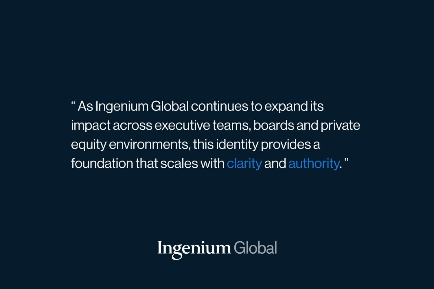
Ingenium Global had quietly outgrown its own story. Founded as an HR and talent consulting firm, the practice now advises CEOs, board chairs, and C-suite leaders at public companies, private equity-backed firms, and mission-driven organisations – with expertise spanning executive assessment, coaching, leadership development, pharmaceutical diligence, and board optimization. The website said none of this. It undersold the calibre of clients, the depth of the two principals, and the relational way the practice actually works. The brief was a complete repositioning: brand strategy, visual identity, messaging framework, a new Webflow website with case study architecture, copywriting, SEO and AI search foundations, and LinkedIn presence – one coherent system, not a collection of fixes. The real challenge underneath: showing breadth without losing focus, and credibility without trading on past job titles.

From service lines to a single sentence

The strategic work began with a positioning problem disguised as a design problem. Ingenium’s capabilities are genuinely broad – assessment, coaching, development, diligence, board work – and breadth is exactly what makes consulting brands go vague. Our first move was compression: one positioning statement that holds everything. Ingenium Global helps organisations maximise the performance of their most critical leaders. From there, the tagline evolved from “co-creating human possibilities” to “co-creating leadership possibilities” – a one-word shift that relocated the entire practice from general human development to high-stakes leadership work. Every page, profile, and asset now descends from that sentence.
Intentionally typographic. The serif signals intellectual depth; the sans-serif “Global” introduces precision. Restraint reflects maturity.
One identity, six applications. Dark on light, light on dark – it holds across every context without variation.

A flexible CMS

The website was architected in Webflow as a platform, not a brochure. Case studies are 20–25% of the site’s total value — they’re proof, SEO assets, and the structured content AI search engines draw from – so we built a full CMS architecture around them: a case study collection with consistent fields for challenge, approach, impact, and learnings; an Insights collection for evergreen thought leadership; and a component library that keeps every new page on-brand without a designer in the loop. The information architecture routes visitors by need – leadership development toward Sandhya, pharmaceutical diligence and board work toward Matt – so the site doesn’t just inform, it qualifies. New case studies and articles now take an editing session, not an engagement.
Deep navy anchors authority. Soft grey introduces composure. Accent blue used sparingly – for guidance, never to overpower.
A practice that advises on performance needs to present data with the same rigour it applies to people.
Every collateral piece – reports, decks, documents, descends from the same identity. The brand compounds rather than fragments.

The results: A brand that finally matches the client list

The most important outcome is alignment: Ingenium Global’s external presence now reflects the practice it actually became, a leadership optimization partner for C-suite and board-level work, not the HR consultancy its old site described. The principals walk into conversations with positioning, language, and materials that hold up against the calibre of organisations they serve. Operationally, the CMS lets the team publish new case studies and insights without developers, and the brand system – from slide decks to email signatures to LinkedIn, keeps every touchpoint coherent. Strategically, the SEO and AI search foundations are built for how senior buyers research today: quietly, thoroughly, and before they ever reach out.
Positioning

Repositioned

From HR consultancy to C-suite leadership optimization practice
Brand system

Unified

One identity across website, decks, documents, collateral, and LinkedIn
Content publishing

Self-serve

Case studies and insights added by the client team through the CMS

A voice calibrated to seventy-thirty

The brand personality was defined precisely: 70% serious, 30% warm. That ratio became a working instrument, not a slide. Copywriting across the homepage, service pages, and team narratives was tested against it, credible and grounded in evidence, but never sterile; direct and confident, but never trading on past prestigious roles. We deliberately avoided the “ex-McKinsey syndrome” common to the category, building credibility from current work and long-standing client relationships instead. The same calibration guided the photoshoot we directed, with a detailed brief translating brand values into composition, light, and posture, and shaped the visual identity’s restraint: no clichéd leadership blue, no consultant pastels, deep neutrals with one warm, strategic accent.
The headline that replaced a generic consulting tagline. Written to land with a CEO preparing for a board transition, not a mid-market HR audience. Six disciplines, one positioning statement. The site routes visitors by need – coaching and development toward Sandhya; pharma diligence and board work toward Matt.

Built for how executives actually research

A practice like Ingenium wins work through reputation and referral, which means the website’s real job is validation, not lead generation. Senior buyers research quietly before reaching out, increasingly through AI assistants as much as search engines. So the site was built for both: clean semantic structure, structured data, meta and Open Graph optimization, an XML sitemap, and deep evergreen content that AI systems can accurately draw from when someone asks who Ingenium Global is and what they do. The LinkedIn layer extends this, both principals’ profiles rewritten and visually aligned with the brand, with a content strategy weighted toward genuine insight over self-promotion. Discovery, validation, and routing now work as one continuous system.
Not a louder brand – a truer one. A foundation built to grow with the practice rather than age toward another rebuild.

Conclusion

Ingenium Global didn’t need a louder brand; it needed a truer one. The repositioning closed the gap between the practice’s actual work, advising the most senior leaders at substantial organisations, and the way the world could see it. The new identity, website, content architecture, and LinkedIn presence now operate as one system, built on Webflow’s CMS so it grows with every new engagement rather than ageing toward another rebuild. The principals gained something practical: materials and positioning that hold their own in C-suite conversations. We believe repositioning work should amplify what’s already true rather than invent what isn’t, and Ingenium’s credibility was real long before we arrived.

More Work

ABtA

Web design, UX architecture, and WordPress development for an ABA therapy provider serving families across North Carolina.

Your competitors aren't waiting. Neither should you.

Whether you’re starting from nothing, refreshing something that’s fallen behind, or finally building the brand your business deserves, we’d love to be part of it.

The first conversation is free. There’s no pitch, no pressure, and no obligation. Just an honest look at what you need and whether we’re the right fit.