Project Case Study

A Bridge to Achievement: Sixty pages of answers a worried parent can actually find

A Bridge to Achievement (ABtA) provides ABA therapy and autism services across multiple North Carolina locations, supporting learners from initial diagnosis to meaningful employment. The Complete Studio redesigned and rebuilt their WordPress website, 60+ pages and 60+ team profiles, organised so families find answers in moments, not minutes.
Industry:
Client Location:
Year:
The Stack:

The Brief

A Bridge to Achievement is an ACQ-accredited ABA therapy provider and CASP member operating across the Triad and Southern regions of North Carolina, supporting learners on the autism spectrum, and their families, from initial diagnosis through to meaningful employment. Their challenge was an unusual inversion: most clients want their website to look bigger; ABtA needed theirs to feel simpler while holding more. Families arriving at the site are often stressed, time-poor, and searching for something specific, how ABA works, what insurance covers, which program fits their teenager, who the therapists actually are. The brief: a 60+ page website with 60+ individual team profiles, programs, services, locations, events, FAQs, and deep resource libraries — designed so that density never once feels like difficulty. The real work was information architecture disguised as web design.

Designed for the day someone needs it

Every architectural decision started from one user: a parent, possibly weeks into a diagnosis, visiting at ten at night. That person doesn’t browse, they search for one answer. So we mapped the questions families actually arrive with, what is ABA, will insurance cover this, is there a location near us, who will work with my child, and structured the entire navigation around them. Services, programs, locations, FAQs, and resources each became a clear, predictable path, never more than a couple of clicks deep. The design itself stayed deliberately quiet: generous spacing, plain language, consistent patterns. Simplicity here wasn’t an aesthetic choice; it was the accessibility requirement.
A parent, writing unprompted and at length. Honest architecture and careful content structure created the conditions for this kind of trust to exist.
Each program follows the same structure: who it’s for, how it works, what qualifies you, how to begin. A parent who understands one page has already understood them all.
From the welcome message to the clinical detail, the same clarity at every level, palm-sized.
Families need to know who they’re trusting and where their child will be. The site answers both, in that order.

A flexible CMS

A 60+ page website with 60+ individual team member profiles cannot depend on a developer for every staff change, clinics hire, people grow, programs evolve. So the WordPress build was structured as a content system: a customized theme with templated layouts for team profiles, services, programs, locations, and events, so each content type is consistent by construction and editable by ABtA’s own team. The resource architecture runs the same way, blog, news, national resources, web resources, FAQs, and events and webinars each live in their own organised, expandable section. When a new therapist joins, their profile follows the established template in minutes. The site was designed to absorb growth, more staff, more programs, more locations, without ever needing redesign.

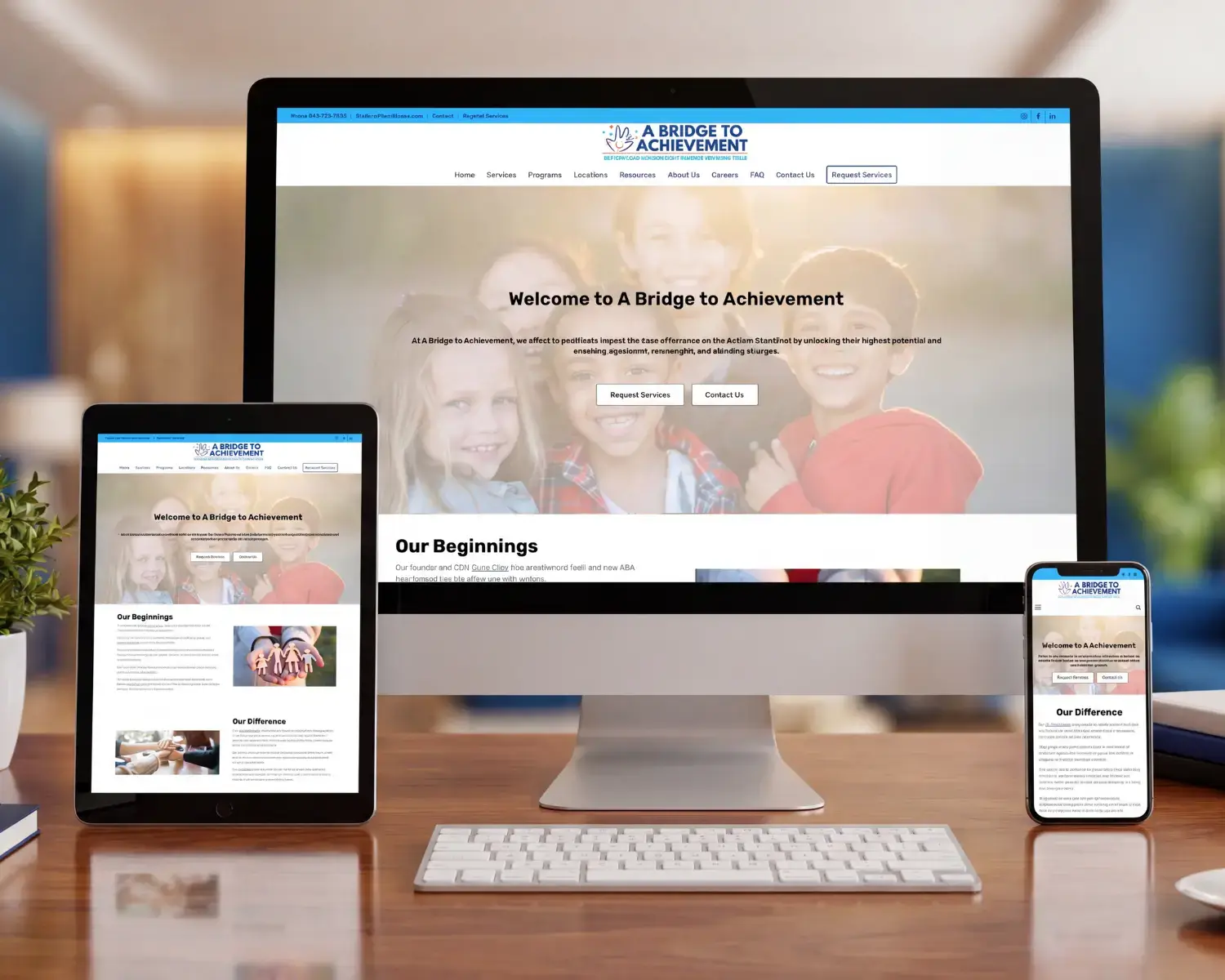
The results: Depth that reads as ease

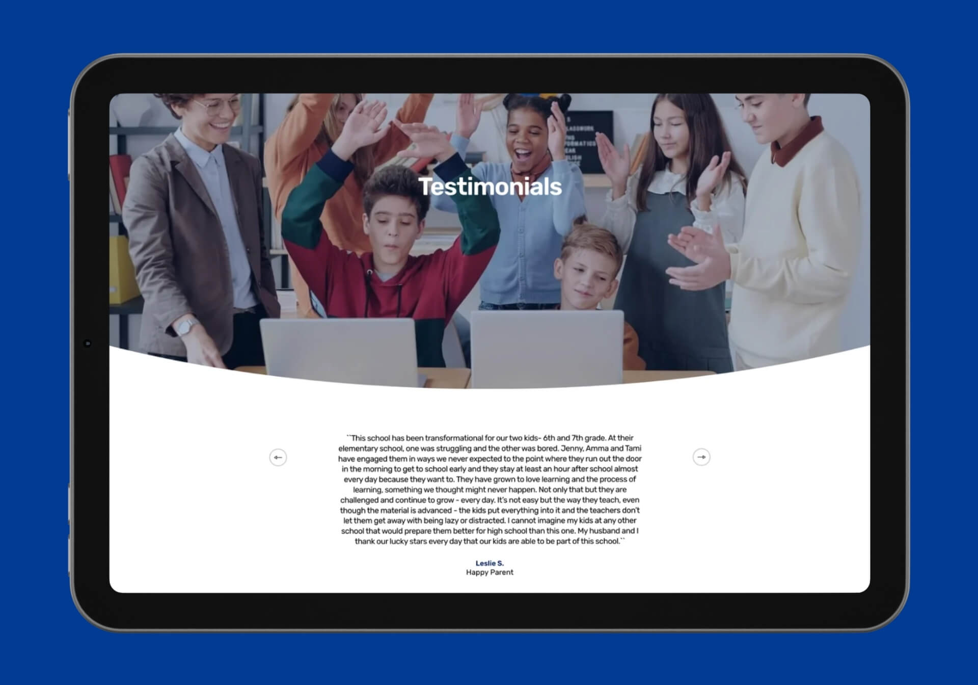
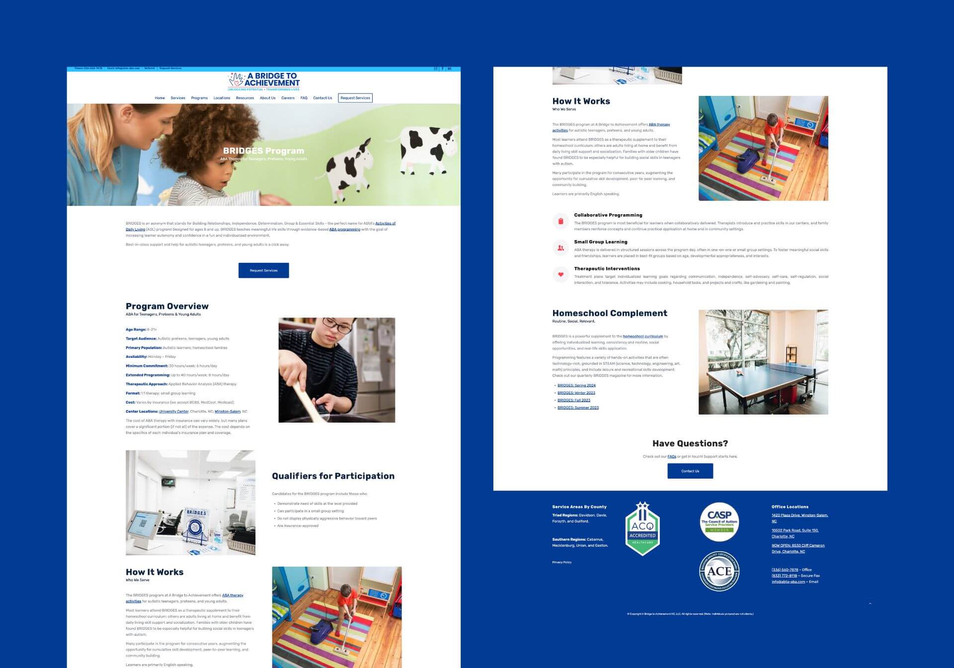
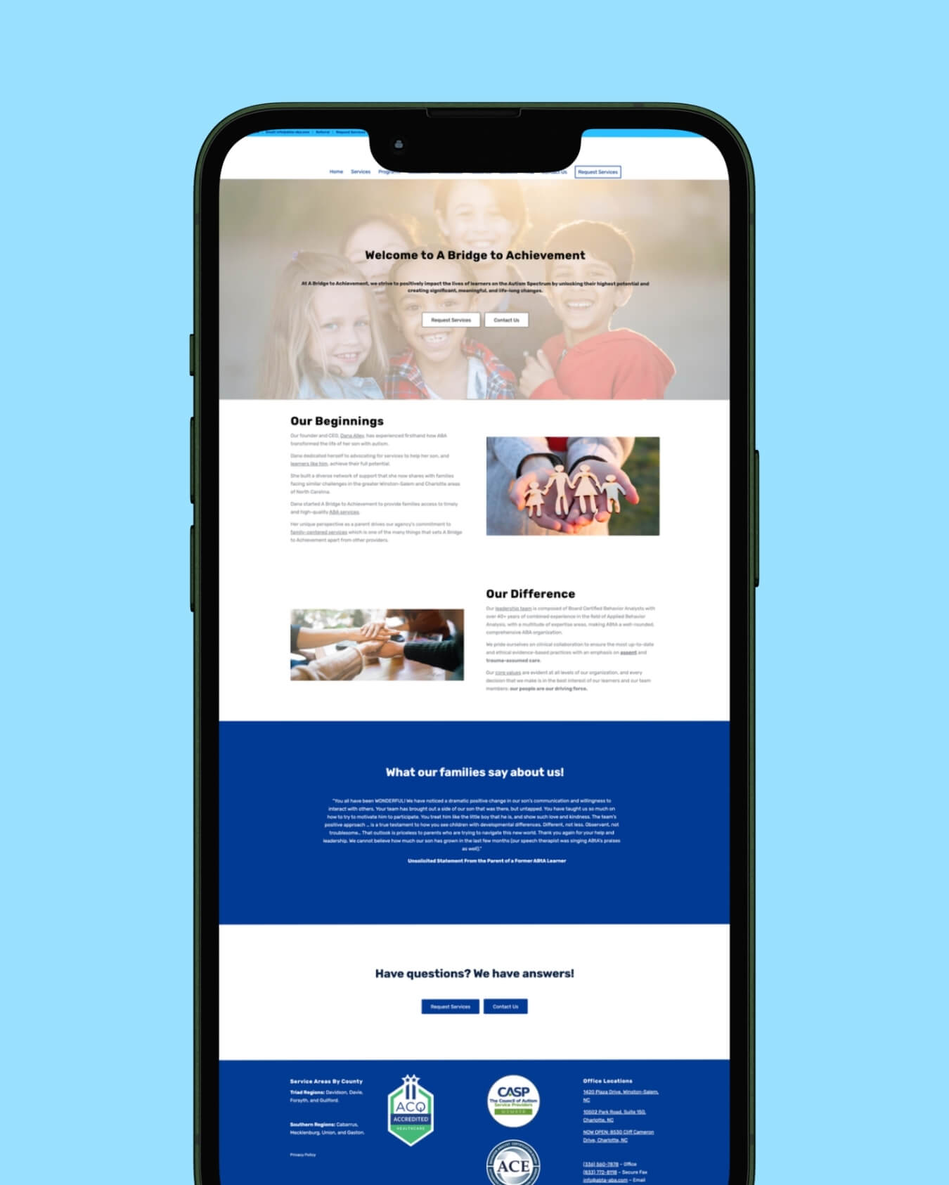
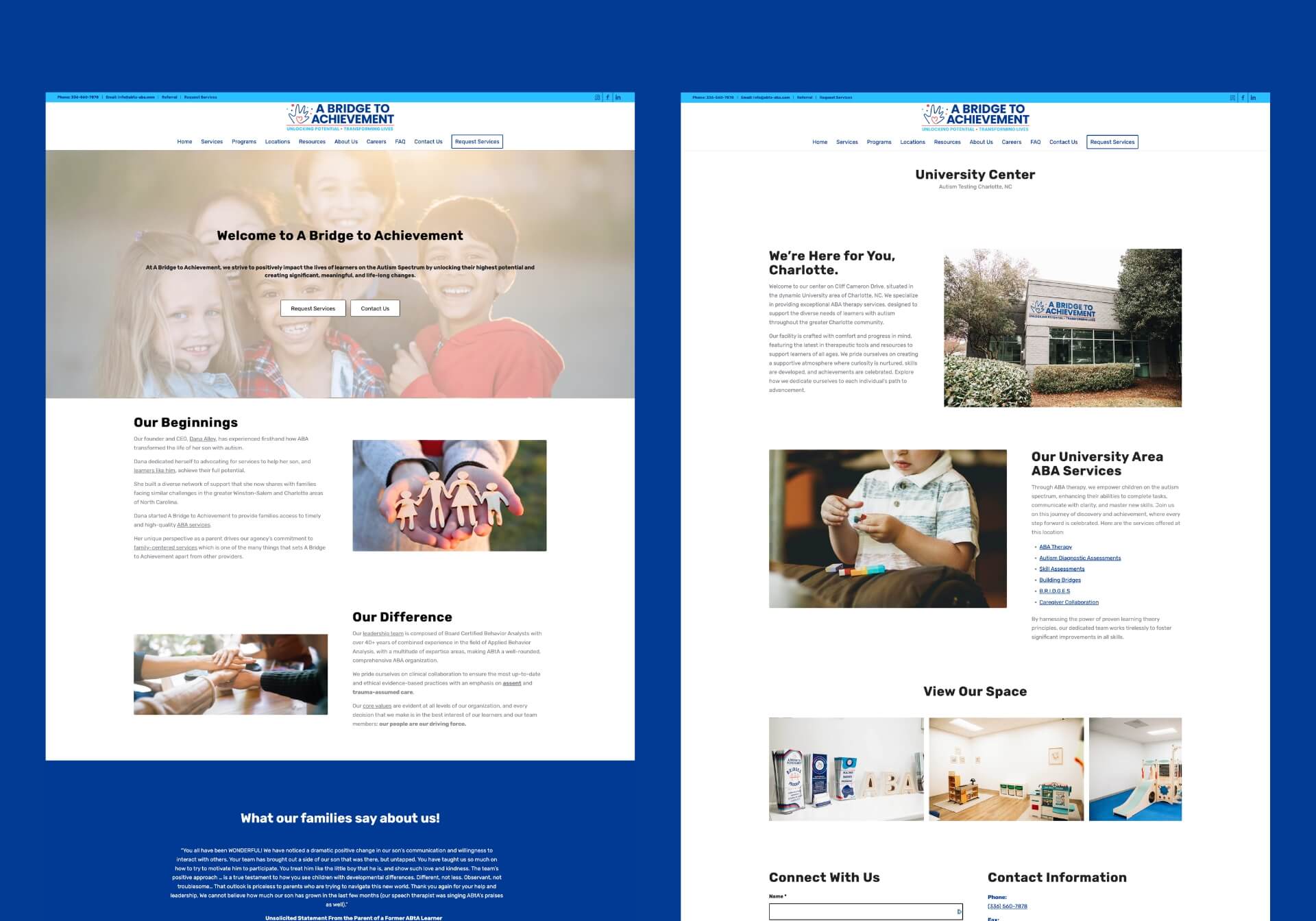
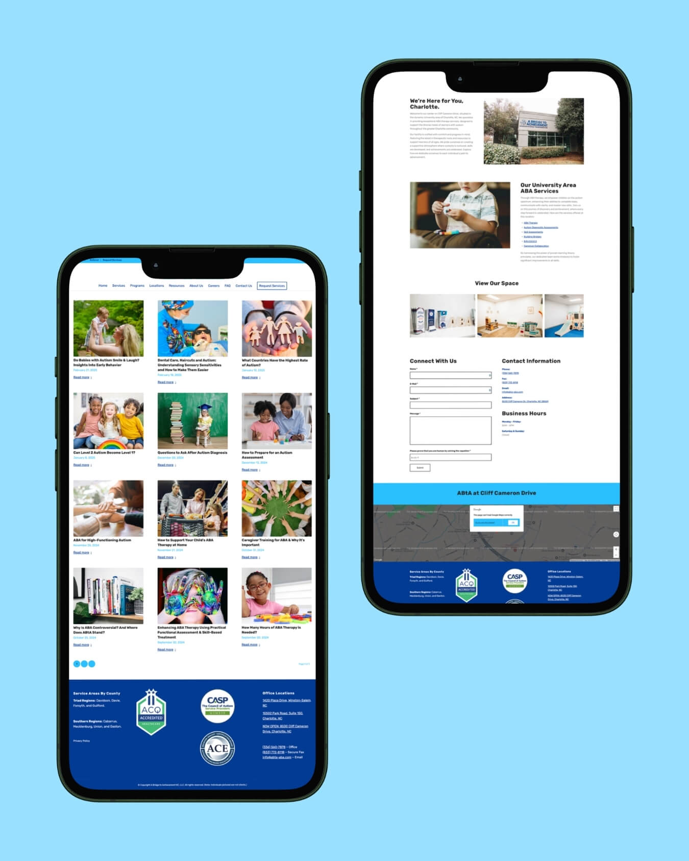
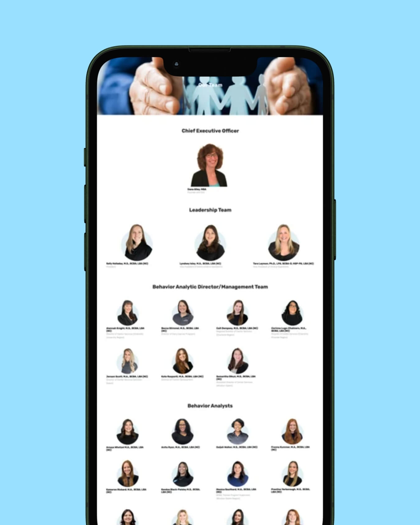
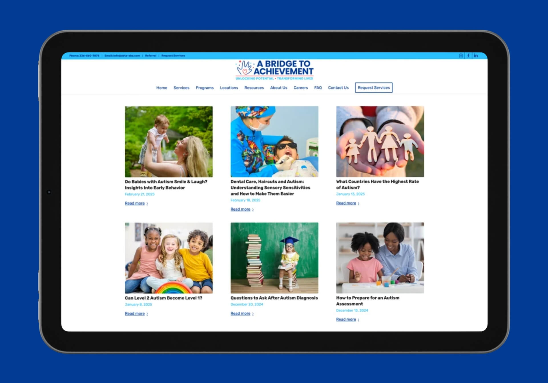
The outcome is a website that does two opposing jobs at once: it holds the full depth of a multi-location ABA practice, every service, program, team member, location, and resource, while feeling simple to the family using it. Visitors find insurance guidance, program details, and the right office without guesswork, which directly serves ABtA’s intake: a clear “Request Services” path is never far away. Operationally, the clinic’s team manages staff profiles, events, and resources independently. Strategically, ABtA’s digital presence now reflects its credentials, ACQ accreditation, CASP membership, evidence-based practice, with the warmth its mission deserves. The partnership continues since 2023, growing as the practice does.
Site scale

60+ pages

Services, programs, locations, events, FAQs, and deep resource libraries
Team profiles

60+ team members

Every clinician introduced before a family's first visit
Navigation depth

A few clicks

Any answer, insurance, programs, locations — reachable without hunting

Writing for the most stressed reader in the room

Content density was the project’s central tension, and we resolved it at the level of craft. Every page was structured for scanning before reading: descriptive headings that answer questions by themselves, short paragraphs, accordions for FAQ-style depth, and consistent page patterns so a visitor who has understood one services page has implicitly understood them all. Clinical accuracy mattered, ABA is an evidence-based practice with precise terminology, but so did translation, so the copy explains concepts like assent-based and neurodiversity-affirming care in language a newly searching parent can hold onto. Readability, contrast, and predictable interaction patterns were treated as design requirements throughout, because for this audience, accessibility isn’t a feature, it’s the brief restated.
The homepage doesn’t sell. It orients. Within a few scrolls, a first-time visitor knows the mission, the team’s credentials, and exactly how to take the next step.
Articles structured around the searches stressed parents actually make. SEO and empathy aligned to the same intent: be findable when it matters most.

A resource library that earns family trust before the first call

Beyond services, the site’s deepest functional layer is its resource ecosystem: blog, news, national autism resources, curated web resources, FAQs, and a dedicated events and webinars section. Strategically, this library does quiet but important work, it makes ABtA useful to families before they’re clients, positions the practice as a knowledge source rather than just a provider, and builds the kind of helpful, well-structured content that search engines and AI systems reward when parents search questions like “what does ABA therapy involve” or “autism services in North Carolina.” Yoast-managed SEO, clean heading structure, and Google Analytics insight underpin it all. The careers section serves the same architecture from the other side: a 60-person team needs to keep growing, and the site recruits as well as it reassures.
Every location gets its own page, its own team, its own address, its own context. One template. Consistent trust, wherever families are.
Forty-plus articles, organised by category, built for search. The resource library works at every stage of a family’s journey, including 10pm on a phone.
Sixty clinicians introduced before a family’s first visit. Every face, credential, and speciality visible from a phone screen, because care begins with knowing who will show up.
The content ecosystem: blog, news, resources, FAQs, events; designed to absorb growth. More staff, more programs, more locations, without ever needing a redesign.

Conclusion

A Bridge to Achievement asked for something deceptively hard: a website with more content than most corporate sites, experienced as simply as a brochure. The answer was architecture, navigation built around families’ actual questions, templated structures holding 60+ pages and 60+ team profiles in consistent order, and writing calibrated for readers under real stress. The practice now has a digital presence that matches its accreditations and its warmth, maintained by its own team, and growing with it since 2023. We believe the highest form of design is the kind nobody notices, because the parent who needed an answer simply found it, and moved on with their day.

More Work

Olena

Custom web design and animation-rich development for an open protocol bringing human judgement to internet information.

Your competitors aren't waiting. Neither should you.

Whether you’re starting from nothing, refreshing something that’s fallen behind, or finally building the brand your business deserves, we’d love to be part of it.

The first conversation is free. There’s no pitch, no pressure, and no obligation. Just an honest look at what you need and whether we’re the right fit.